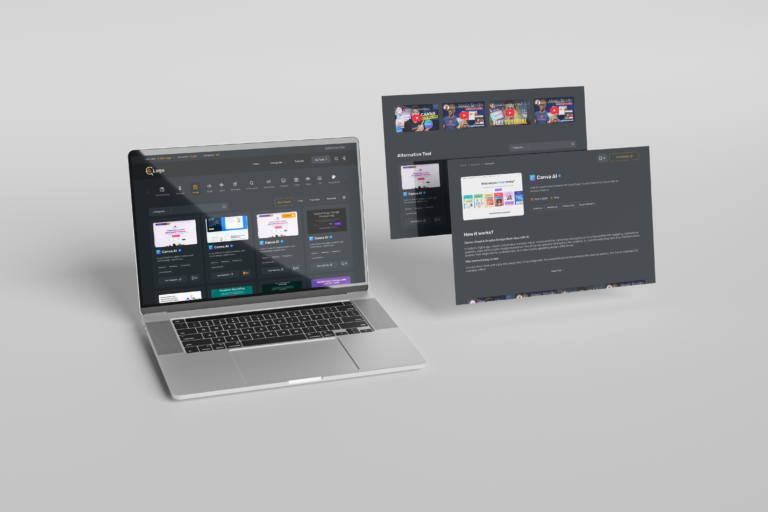
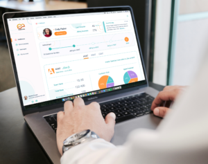
This project was initiated with the primary goal of enhancing user satisfaction and improving the overall user interface experience.
To achieve this, a thorough analysis of 30 competitor websites was conducted. The findings from the competitor analysis helped shape the design of key features and the information architecture, ensuring that the final product is both competitive and user-friendly.
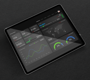
Additionally, at the request of the project owner, a dark color theme was selected to align with their vision and brand identity, offering a modern and visually appealing look to users. The combination of these elements aims to create an engaging and intuitive user experience.

